The Ultimate Guide to UI/UX Best Practices
Author
Share This Article

Table of Contents
The Ultimate Guide to UI/UX Best Practices: Elevate Your Design Skills
Delivering a seamless and engaging user experience (UX) alongside a visually appealing user interface (UI) is pivotal for any digital product’s success. Whether you’re developing a new app, revamping a website, or enhancing an existing platform, adhering to UI/UX best practices ensures your design meets and exceeds user expectations.

Understand Your Users
The cornerstone of any successful UI/UX design is a deep understanding of your users. Knowing who they are, what they need, and how they interact with your product allows you to create experiences that resonate and fulfill their goals.
Key Principles:
User Research: Conduct thorough research using methods such as surveys, interviews, and usability testing to gather insights into your users’ behaviors, preferences, and pain points.
Personas: Develop detailed user personas that represent your different audience segments. These fictional characters should encompass key demographic details, motivations, and challenges your real users face.
User Journey Mapping: Map out the user journey to visualize the steps users take to achieve their goals with your product. This helps identify touchpoints and potential areas of friction.
Best Practices:
Continuous Engagement: Regularly update your understanding of your users through ongoing feedback and research. User preferences and behaviors evolve, and staying in tune with these changes is crucial.
User Involvement: Include real users in your design and testing phases. This ensures that the product meets their needs and expectations, reducing the risk of launching a product that misses the mark.
Problem-Solving Focus: Tailor your design to address specific problems your users encounter. By focusing on their pain points, you create more valuable and relevant experiences.
Tools and Methods:
Surveys & Questionnaires: Use tools like Google Forms or SurveyMonkey to collect quantitative data.
User Interviews: Conduct one-on-one sessions to dive deeper into user behaviors and motivations.
Usability Testing: Platforms like User Testing or Lookback can help you observe how users interact with your product.
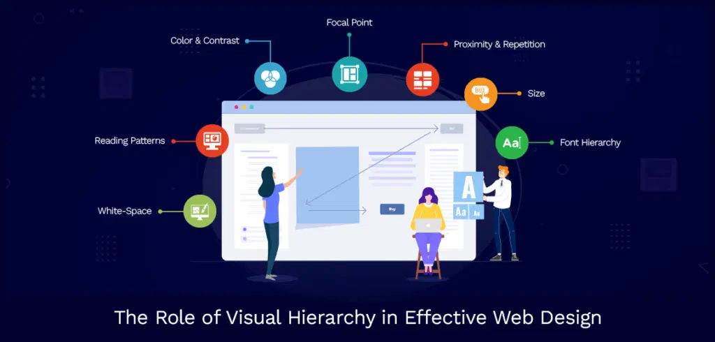
Focus on Visual Hierarchy
Visual hierarchy is about organizing elements on a page in a way that naturally guides the user’s eye to the most important content first. Effective use of hierarchy makes your design intuitive and helps users understand and navigate your interface effortlessly.
Key Principles:
Prioritization: Emphasize the most critical elements using size, color, and placement. This could be your main message, call to action (CTA), or key visuals.
White Space: Utilize white space (or negative space) to create breathing room around elements. This not only enhances aesthetics but also improves readability and focus.
Contrast: Employ contrasting colors and styles to highlight significant areas and ensure that text and essential elements stand out against the background.
Best Practices:
Headline Focus: Make your primary headlines and CTAs prominent with larger fonts and bolder colors.
Clutter-Free Layouts: Keep your designs clean and organized. Avoid overcrowding elements to maintain a clear path for the user’s eye.
Visual Cues: Use visual cues like arrows, lines, or color gradients to guide users’ attention from the most crucial to the least crucial elements.
Tools and Methods:
Wireframing: Use tools like Figma or Sketch to create wireframes that outline the structure and hierarchy of your design.
Design Systems: Implement design systems to maintain consistent visual hierarchy across different parts of your product.
Accessibility Checkers: Ensure that your color contrast meets accessibility standards with tools like WebAIM’s Contrast Checker.

Maintain Consistency
Consistency in design creates a sense of familiarity and predictability for users, making your interface easier to navigate and understand. Uniformity in visuals and interactions across your product helps users feel more comfortable and confident in using it.
Key Principles:
Uniform Design Language: Apply a consistent style for elements such as buttons, icons, typography, and colors. This builds a cohesive and professional look and feel.
Reusable Components: Design components (like buttons, forms, or navigation bars) that can be reused across different sections of your product. This saves time and ensures consistency.
Predictable Behavior: Ensure similar actions result in similar outcomes. For example, all form fields should behave the same way when filled out incorrectly.
Best Practices:
Style Guides: Create a comprehensive style guide or design system to document your visual and functional standards. This serves as a reference for anyone working on the project.
Pattern Libraries: Develop and use pattern libraries to maintain uniformity in UI components and interactions.
Regular Audits: Conduct periodic design audits to check for and correct any inconsistencies in your product.
Tools and Methods:
Design Systems: Tools like Storybook or Design System Manager (DSM) help you build and manage design systems.
Component Libraries: Use libraries like Material-UI or Bootstrap for consistent and pre-designed UI components.
Design Tokens: Utilize tools like Style Dictionary to manage and implement design tokens for consistent styling.
Design for Accessibility
Inclusive design ensures that your product is usable by everyone, including people with disabilities. Designing with accessibility in mind not only broadens your audience but also improves the overall usability and quality of your product.
Key Principles:
Inclusive Design: Design interfaces that accommodate diverse abilities and needs. This includes users with visual, auditory, motor, and cognitive impairments.
Contrast and Readability: Ensure text and essential elements have sufficient contrast against their backgrounds. Use readable fonts and adequate font sizes.
Keyboard Navigation: Make sure all functionalities are accessible via keyboard alone, supporting users who cannot use a mouse.
Best Practices:
Alt Text for Images: Provide descriptive alt text for images to convey their content to users relying on screen readers.
Text Alternatives: Offer text alternatives for non-text content like videos and audio.
Accessibility Testing: Regularly test your designs with accessibility tools and involve users with disabilities to identify and address potential issues.
Tools and Methods:
Screen Readers: Test your website with screen readers like JAWS or NVDA to ensure it’s navigable.
Color Contrast Checkers: Tools like the WebAIM Contrast Checker can verify that your text and background color combinations are accessible.
Accessibility Guidelines: Follow guidelines such as the Web Content Accessibility Guidelines (WCAG) for standards on making web content more accessible.
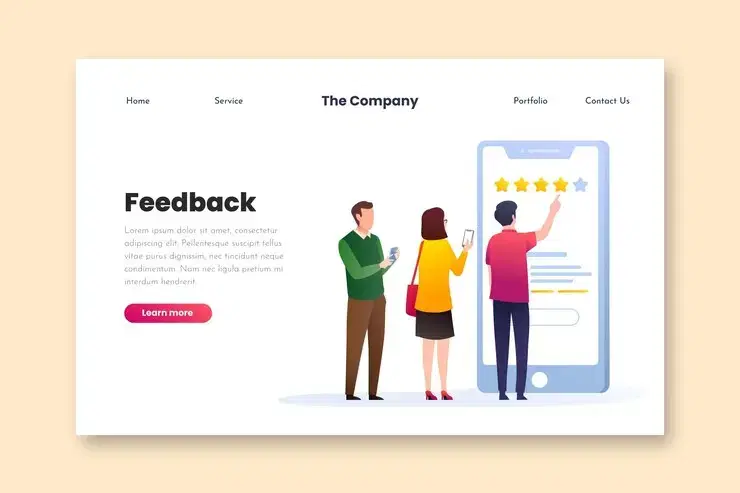
Provide Clear Feedback
Feedback is crucial in guiding users through their interactions with your product. Clear and immediate feedback lets users know whether their actions are successful or if they need to take corrective measures, enhancing their confidence and satisfaction.
Key Principles:
Responsive Design: Ensure your interface responds quickly to user inputs with appropriate feedback.
Error Handling: Design informative and actionable error messages that guide users to correct their mistakes.
Loading Indicators: Use visual indicators like spinners or progress bars to inform users when the system is processing their actions.
Best Practices:
Visual Cues: Employ animations and visual cues to confirm actions, such as button presses or form submissions, are recognized.
Helpful Error Messages: Craft clear, concise, and friendly error messages that explain the problem and offer solutions.
Loading Feedback: Provide feedback during loading or processing times to keep users informed and reduce perceived wait times.
Tools and Methods:
Microinteractions: Use subtle animations and transitions for feedback, designed with tools like After Effects or Lottie.
Real-Time Validation: Implement real-time form validation to give immediate feedback as users fill out forms.
Performance Testing: Tools like Google Lighthouse can help you assess and improve your site’s responsiveness and feedback mechanisms.

Optimize for Mobile
With the increasing use of mobile devices, ensuring your product delivers a great mobile experience is essential. Responsive design and mobile-friendly interfaces are critical to engaging and retaining users on smaller screens.
Key Principles:
Responsive Design: Create layouts that adapt smoothly to different screen sizes and orientations. This includes scaling elements and adjusting content arrangements.
Touch-Friendly Elements: Design buttons and interactive elements large enough to be easily tapped with fingers, typically at least 44px by 44px.
Simplified Navigation: Streamline menus and navigation for mobile users, utilizing icons, collapsible sections, or simplified menus.
Best Practices:
Mobile-First Design: Start designing for the smallest screen first, then progressively enhance for larger screens. This ensures that essential content and functionality are prioritized.
Cross-Device Testing: Test your design on a variety of devices and screen sizes to ensure a consistent experience across all platforms.
Performance Optimization: Minimize load times and optimize performance for users on slower mobile connections. Use tools like Google’s Page Speed Insights for mobile performance assessment.
Tools and Methods:
Responsive Frameworks: Use frameworks like Bootstrap or Foundation to build responsive designs.
Mobile Testing: Tools like Browser Stack allow you to test your design on multiple devices and browsers.
Progressive Enhancement: Focus on delivering a basic, functional experience to all users first, then add enhancements for devices that can support them.

Prioritize Performance
A fast, efficient, and responsive interface is crucial for user satisfaction. Long loading times and sluggish interactions can frustrate users and drive them away. Optimizing your product’s performance ensures it runs smoothly and keeps users engaged.
Key Principles:
Fast Loading Times: Reduce the time it takes for pages and actions to load. This involves optimizing images, scripts, and other resources.
Efficient Resource Use: Streamline your code and assets to minimize the burden on users’ devices and networks.
Smooth Interactions: Ensure animations and transitions are fluid and responsive, providing a seamless experience.
Best Practices:
Image Optimization: Compress images and use modern formats (like WebP) to reduce their file sizes without compromising quality.
Lazy Loading: Implement lazy loading for images and videos so they only load as needed, speeding up initial page loads.
Code Minification: Minify CSS, JavaScript, and HTML files to reduce their size and improve load times.
Tools and Methods:
Performance Analysis: Use tools like Google Lighthouse or GTmetrix to analyze and optimize your site’s performance.
Content Delivery Networks (CDNs): Employ CDNs to distribute your content globally and reduce latency.
Caching Strategies: Implement browser and server-side caching to store frequently accessed data locally, reducing load times.

Use Data to Inform Decisions
Data-driven design leverages user data and analytics to guide decisions, leading to more effective and user-centric outcomes. By continuously monitoring and analyzing user interactions, you can refine and optimize your product to better meet their needs.
Key Principles:
Analytics: Track and analyze user behavior to understand how they interact with your product and identify areas for improvement.
A/B Testing: Experiment with different design variations to determine which performs better with your audience.
User Feedback: Collect feedback directly from users to gain insights into their experiences and preferences.
Best Practices:
Key Metrics Monitoring: Set up dashboards to monitor key metrics like user engagement, conversion rates, and drop-off points.
Continuous Testing: Regularly conduct A/B tests to evaluate different design elements and make informed decisions based on the results.
User Surveys: Use surveys and feedback forms to gather qualitative data on user satisfaction and areas for improvement.
Tools and Methods:
Analytics Platforms: Use tools like Google Analytics or Mix panel to track user interactions and gather insights.
A/B Testing Tools: Platforms like Optimizely or Google Optimize help you run and manage A/B tests.
User Feedback Tools: Tools like SurveyMonkey or Hotjar can help you collect and analyze user feedback effectively.

Simplify and Streamline
Simplicity and clarity are key to creating intuitive and effective user interfaces. By reducing complexity and focusing on essential elements, you make it easier for users to navigate and accomplish their goals without confusion or frustration.
Key Principles:
Minimalism: Remove unnecessary elements to keep the interface clean, focused, and easy to understand.
Clarity: Use clear and straightforward language and visuals to communicate your message effectively.
Ease of Use: Simplify workflows and reduce the number of steps needed to complete tasks, making the user experience more efficient.
Best Practices:
Content Prioritization: Focus on what’s most important and eliminate any elements that don’t add value to the user experience.
Concise Communication: Use simple, direct language and avoid jargon or overly complex instructions.
Intuitive Navigation: Design clear and logical navigation paths that guide users to their goals with minimal effort.
Tools and Methods:
Content Audits: Regularly review your content to remove or consolidate unnecessary elements.
User Flows: Map out user flows to identify and streamline the steps users take to accomplish their goals.
Usability Testing: Conduct usability tests to observe how easily users can navigate and complete tasks, and simplify based on their feedback.
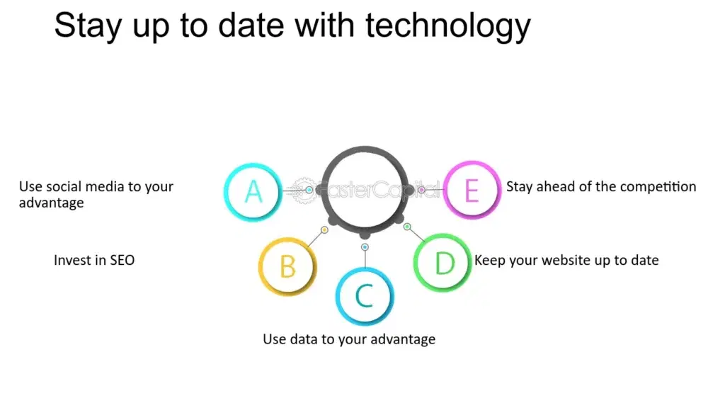
10. Stay Up-to-Date with Trends and Technology
The digital landscape is constantly evolving, and staying current with the latest UI/UX trends and technologies is essential for maintaining a competitive edge. Continuous learning and adaptation ensure your designs remain relevant and innovative.
Key Principles:
Continuous Learning: Keep up with the latest developments in UI/UX design, tools, and methodologies.
Adaptability: Be open to evolving your design strategies and approaches based on new insights and technologies.
User-Centric Innovation: Focus on how emerging trends and technologies can enhance the user experience and solve user problems.
Best Practices:
Trend Monitoring: Follow industry blogs, participate in webinars, and join design communities to stay informed about new trends and best practices.
Tool Exploration: Experiment with new design tools and technologies to find ways to improve your design process and output.
Regular Updates: Periodically review and refresh your designs to incorporate the latest UI/UX trends and improvements.
Tools and Methods:
Design Blogs & Websites: Follow sites like Smashing Magazine, UX Design.cc, and Nielsen Norman Group for the latest insights and trends.
Online Courses & Webinars: Platforms like Coursera, Udemy, and LinkedIn Learning offer courses on new design techniques and tools.
Design Communities: Join forums and groups on platforms like Dribble, Behance, or Reddit to connect with other designers and share knowledge.
Conclusion:
Mastering UI/UX best practices is not just about creating visually appealing interfaces—it’s about crafting experiences that resonate with users on a deeper level. By understanding your users, maintaining consistency, and optimizing for accessibility and performance, you set the foundation for impactful digital experiences.
Remember, design is a continuous journey of learning and improvement. Stay agile, adapt to new technologies and trends, and always prioritize user feedback and data-driven insights. This iterative approach ensures that your designs evolve alongside user expectations and industry standards.
Creating a seamless user experience isn’t just a goal—it’s a competitive advantage. By implementing these principles and staying informed, you can create interfaces that not only meet but exceed user expectations, driving engagement, satisfaction, and ultimately, business success.